
Not only Adobe has released new features for Photoshop but Adobe has added some new features to Lightroom Classic & Adobe Camera Raw Filter as well. Today, we gonna take a look at the brand feature of Lightroom Classic which is the Color Grading Tab.
It is not new what they did is transformed and made the Split Toning Tab more powerful and introduced a new tab called “Color Grading”. The color wheels inside the Color Grading tab can look overwhelming and you might be confused about what to do here but don’t worry I am gonna cover everything about this brand new feature. Let’s get into it.
Step 1 – Find The Color Grading Tab
You can find the New Color Grading Tab under the Develop module. You can check the screenshot below where you can find it and you can see that it has replaced the OLD Split Toning tab.

Step 2 – Color Grading Wheels
Now we have three wheels or sliders inside the tab known as Shadows, Midtones, & Highlights. You can click on each of these wheels to edit them individually which I personally recommend.

You can also work with all the sliders at the same time but I’d rather work with each slider individually just to have more control over each area of the image.

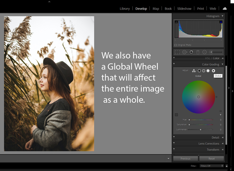
Also, we have another wheel called Global Wheel it will add color to the entire image and will affect the entire image as a whole. Let’s say you have selected colors for highlights, midtones, and shadows, then you used the Global Slider, it’s gonna add color over all the colors leading to terrible results.
If you want to use it, I’d recommend using the Luminance slider of it to control the brightness of the whole image at one go.
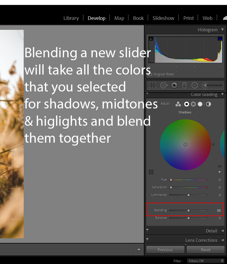
Step 3 – The New Blending Slider
You know that we still have the Balance Slider that shift color from shadows to highlights or vice versa now they have added the new slider called “Blending”, it gonna take all the colors that you selected for shadows, midtones, and highlights and it will blend them together. I will recommend using it on the lower side rather than setting it to 100.
Step 4 – Start Color Grading
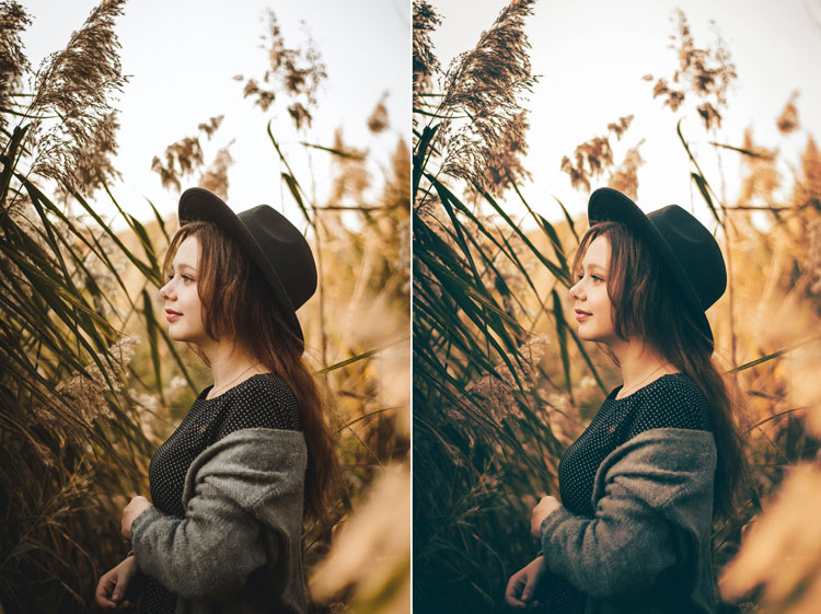
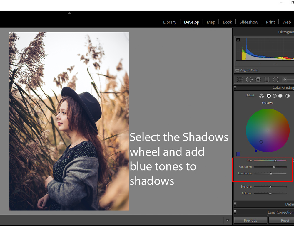
To start color grading, I added cool tones to the image. You can see in the setting below that I added blue color to the shadows of the image. Now, you can also play around with the Luminance Slider to the color brighter or darker.
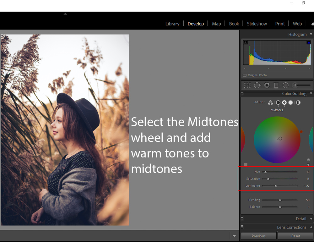
I added a warmer color to midtones by switching to the Midtones wheel. You can see the settings below.
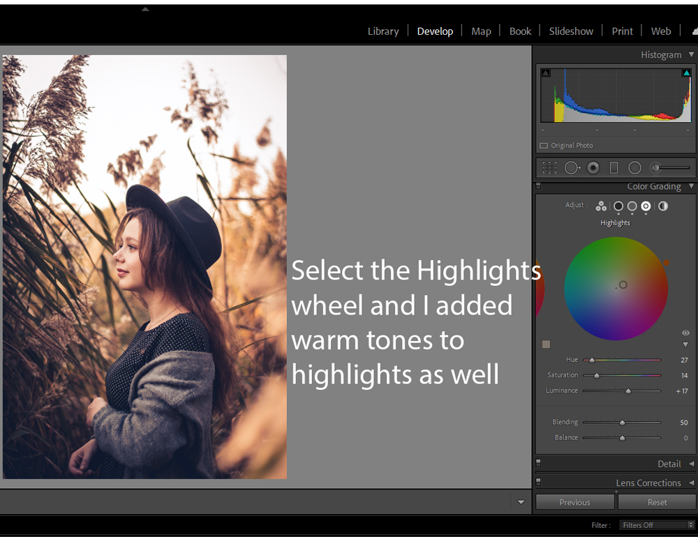
Similarly, I added a warmer color to Highlights to make the skin tones look natural and amazing.
Here you can see before & after results:

Step 5 – A Few Tips
If you don’t like it just because of the new Midtones & Blending Slider, just ignore them and you can still add coloring to Highlights & Shadows using the Shadows & Highlights sliders.

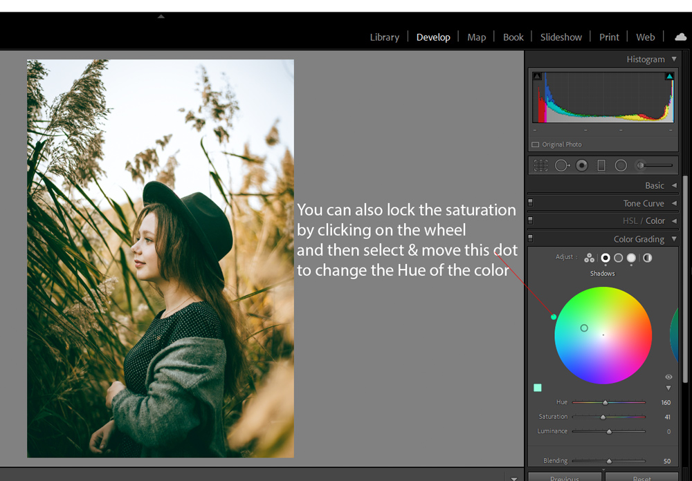
One more cool thing is if you find a saturation point of a color that you’d like to add, you can leave it there and then move around the dot outside of the wheel to change the hue of the color.
I hope you enjoyed the tutorial. Did you like it or maybe it is confusing for you? Let me know your feedback about this new color grading feature in the comments below.
Need Help With Photoshop or Looking for Professional Support?
Whether you're just getting started with Photoshop or need expert-level assistance, we're here to help! Contact us for personalized Photoshop tutorials, project support, or creative services.
Get in touch today to take your skills or projects to the next level.
CONTACT US NOW📘 Want to Master Photoshop Faster?
🎁 Get Your FREE PDF E-Book "Top 10 Photoshop Tricks Every Designer Must Know" Now – Packed with expert tips, shortcuts, and techniques to boost your creativity & workflow.
👉 Download Your FREE PDF E-Book NOW!