If you used any post-processing software such as Photoshop, Lightroom, Luminar, or ON1, will have come across an editing tool called “Tone Curve”. The Tone Curve is one of the best tools when it comes to adjusting the brightness, contrast, exposure, & colors of the image.
With the Tone Curve, you can target just Shadows, Midtones, & Highlights while keeping other areas intact in the image. Initially, it is very daunting to learn but if you get yourself under the hood of Tone Curve, it will become your go-to tool for exposure adjustments and color grading.
In this beginner-level tutorial, you’ll learn the basics of Tone Curve in Lightroom. I’ll go through every aspect of Tone Curve to demystify your doubts about this awesome tool. Not only you’ll learn its basic use but how to use other channels of Tone Curve such as Red, Blue & Green to add coloring as well.
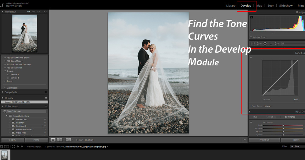
Where to Find Tone Curve?
You can find the Tone Curve in the Develop Module. To start working in Develop Module, you need to import images in Lightroom. Then select the Develop module on the very top to access the Tone Curve. You can find the Tone Curve on the right of your screen.
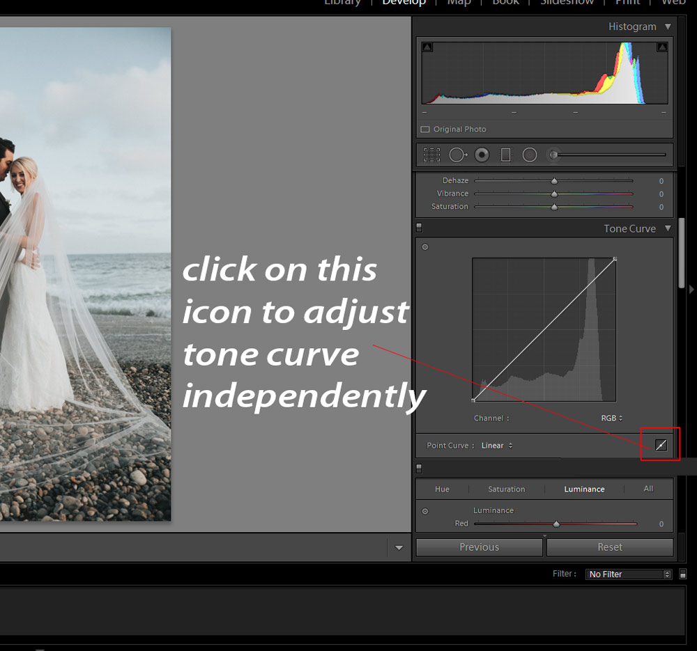
Edit Point Curve
By default, the Tone Curve won’t allow you to add any points on the line. To use the Tone Curve independently, click on the icon that says Click to Edit Point Curve & this will allow you to use the Curve just like Photoshop’s Curves adjustment layer. Once you click on the icon, you will able to add points on the line of the Tone Curve which gives you much more control to affect different tones in the image.
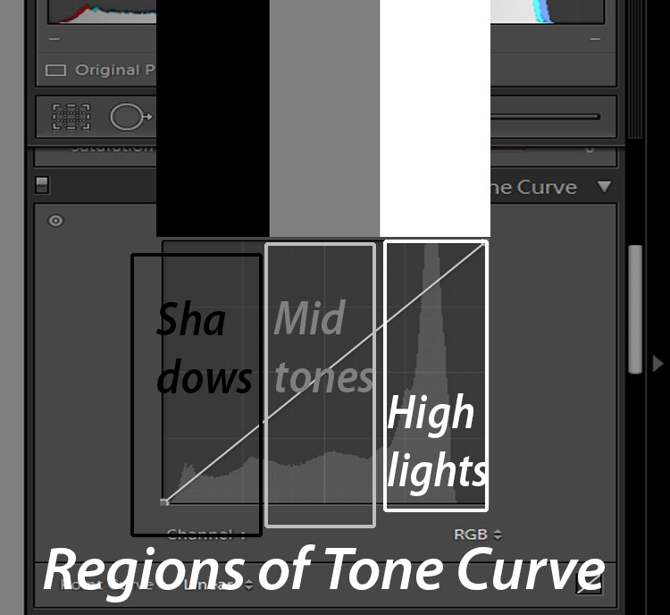
Regions of Tone Curves
What makes this tool special is the way it affects the image tones. There are 3 regions in Tone Curves, which generally not visible in Tone Curve, Shadows, Midtones, & Highlights. When you add a point in any of these regions you’ll able to alter tones depends on where you add the point.
In the below image, Shadows are represented in the Black, Midtones in Grey & Highlights are in White.
Let’s say that you want to increase the brightness on highlights, add a point in the Highlights region, and pull the Curve up to increase the brightness on highlights. Similarly, you can add points to shadows, midtones to dial-up & down the brightness & contrast in those regions.
Dial Up & Down The Exposure with Tone Curves
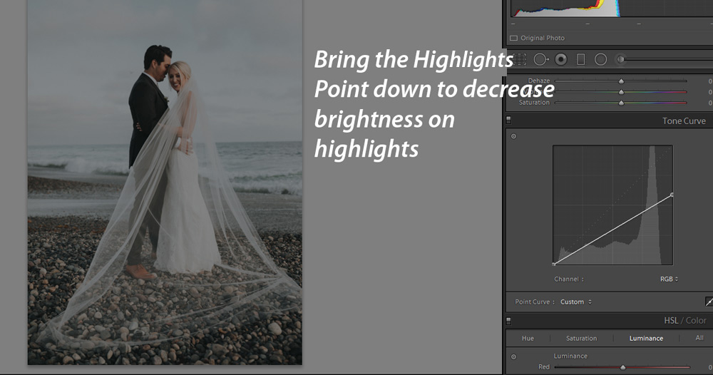
If you want to decrease the exposure on the highlights of the image, simply bring the Curve down as shown below. You can keep going until you start seeing the highlights are starting to dim.
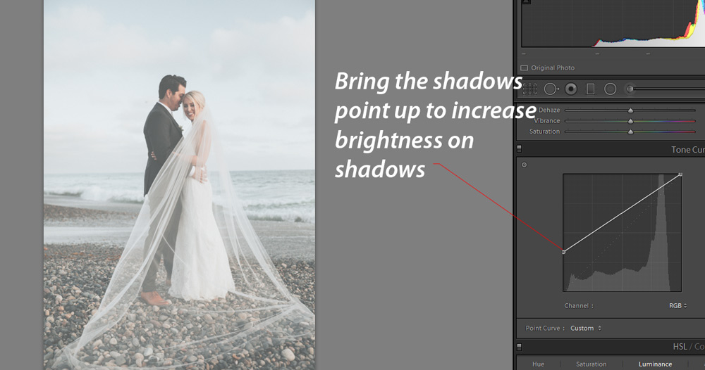
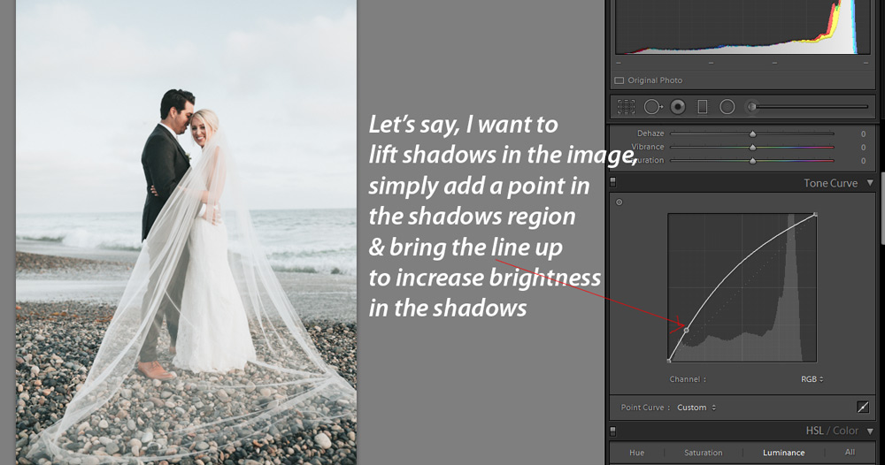
If you want to lift shadows or maybe you want to pull more information from the shadows region just pull the Shadows point up to add more exposure to shadows of the image.
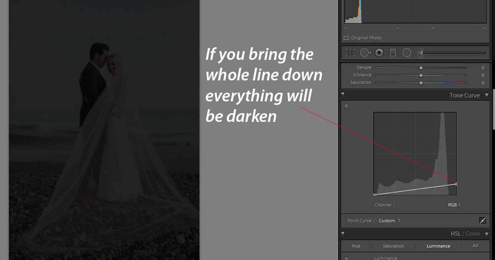
If you want to darken the whole image, bring the whole curve down.
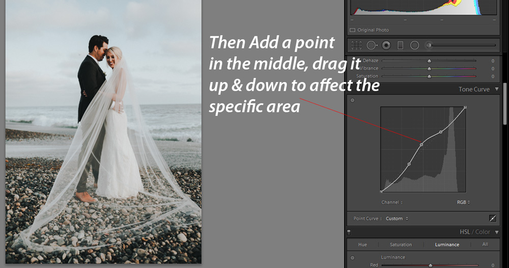
Target Midtones & Specific Areas
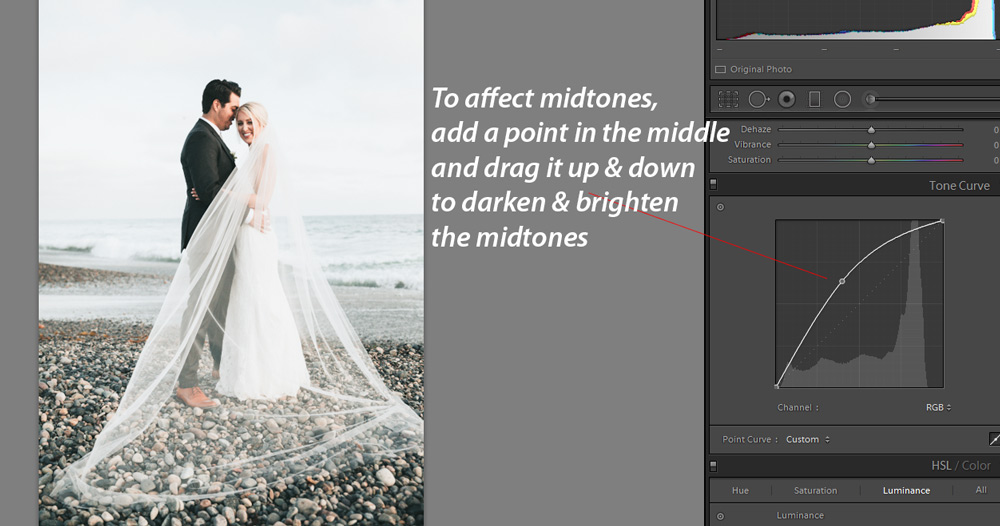
You can target midtones of the image by simply adding a point in the middle of the line, either bring the curve up or down to increase & decrease the exposure of the midtones.
You can also target specific areas of the image. Let’s say that you just want to alter the midtones values and you don’t want to affect highlights & shadows. First, add the lowest point on the line & then add the highest point on the Tone curves.
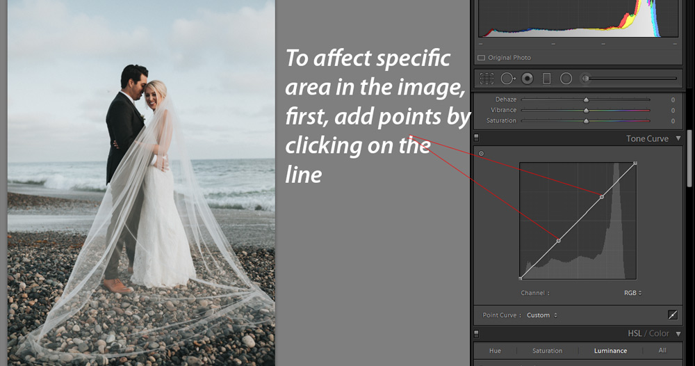
Add a point in the middle of these two points and bring it up & down to affect the region that is inside the two points.
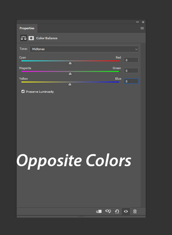
Opposite Color Theory
Before we get into coloring with the Tone Curve, you must know about the opposite color theory of three colors Red, Green, & Blue. To understand opposite Color theory just simply put this sentence in your mind, Red sits opposite Cyan, Green’s opposite is Magenta & Blue’s opposite is Yellow.
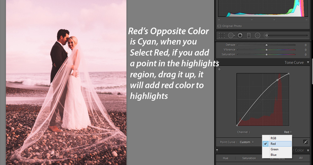
Coloring: Red & Cyan
Not only you can use the Tone Curve to adjust the exposure of the image but you can use it for color grading, color correction & coloring your images. Let’s get into coloring with the Tone Curve. To access the Channel of Tone Curve, click on the icon right opposite to Channel as shown below
Also, where you add points does affect coloring in the image, in the below image I added a point in the highlights, I pulled it up to add red color to the highlights of the image. This will add red color just to the highlights of the image. You can do the same with shadows as well, just add a point in the region of the shadow, lift it to add red coloring to shadows.
Remember, when you add Reds you are also canceling out the Cyans in the image & vice-versa.
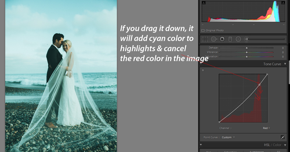
Since the cyan color is opposite to red, you can drag the Curve down to add cyan coloring to the image. Remember right now we have affected just the highlights as we added a point in the highlights region.
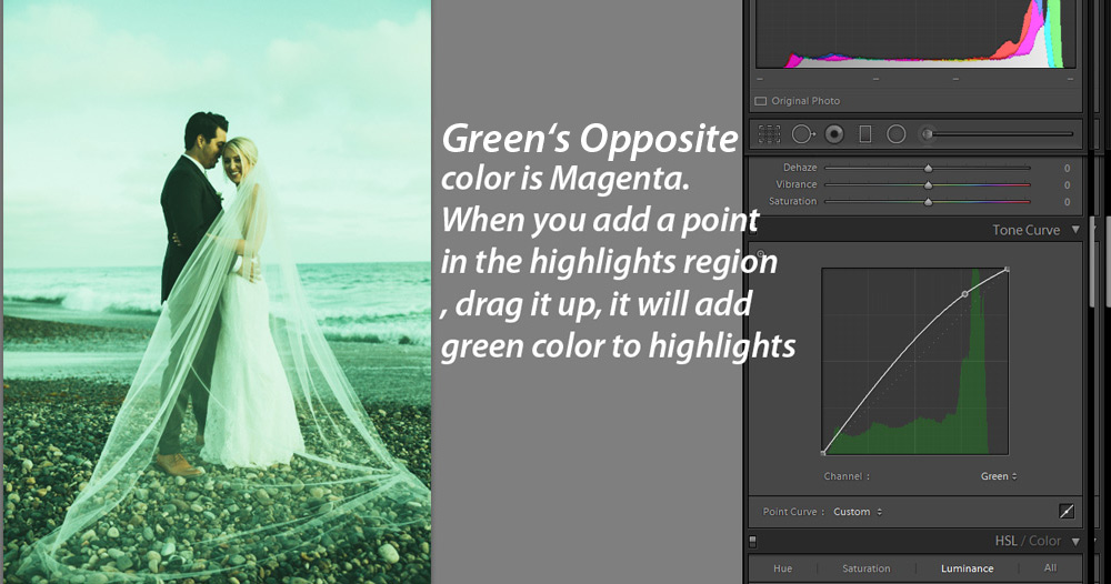
Coloring: Green & Magenta
Similarly, I switched to Green Channel and used it in the same way as I did with the Red channel in the last step. I pull the curve up to add green color to the highlight of the image.
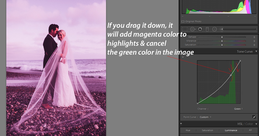
You can drag the curve down to see how it adds magenta tones by canceling out green tones in the image.
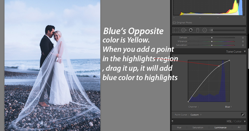
Coloring: Blue & Yellow
Here is the use of the Blue channel where I used it to add blue coloring to highlights.
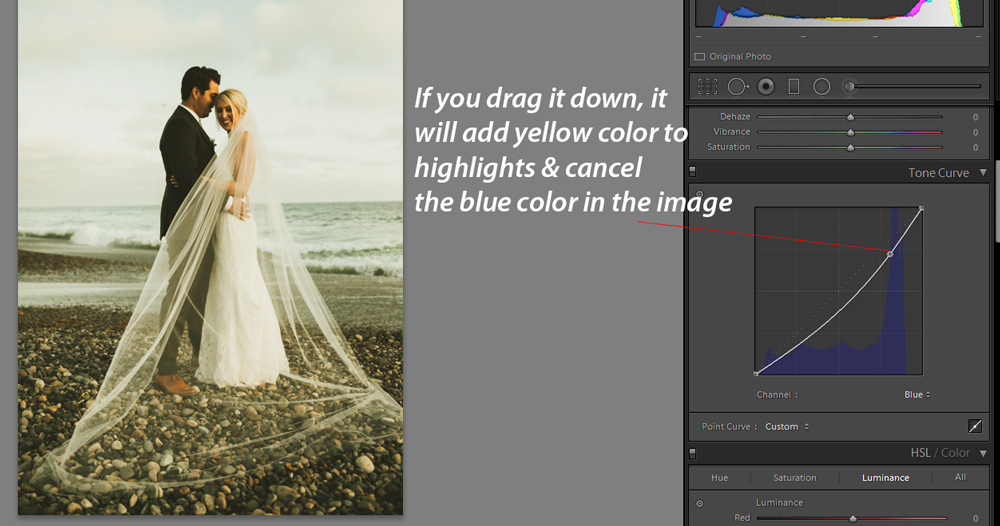
Here I used it to add yellow coloring to highlights by canceling out the blues in the image.
It Depends Where You Add Points
You can independently add points to any region of the image to affect them differently. You can add a point to shadows to lift them, you can add a point to midtones to decrease/increase exposure and you can do the same with highlights as well.
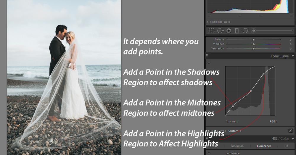
Let’s say that you want to increase the brightness/exposure on the shadows, add a point in the region of the shadows and pull it up to add exposure to the only shadows.
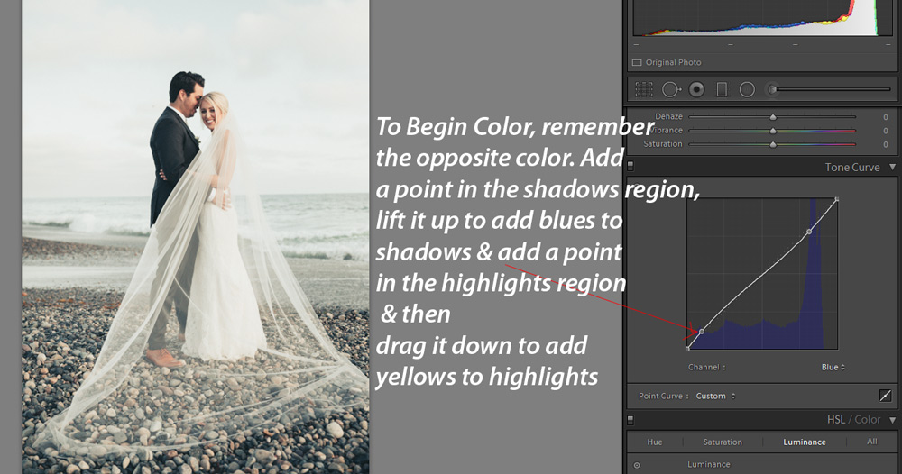
Begin Coloring/Color Grading With Opposite Color Theory
Here you can see that I added a point in the shadows using Blue Channel, and I pulled it up to add blue color tones to the shadows. I also added a point in the highlights, dragged it down to add yellow coloring to highlights. This is how you color grade your images with the Tone Curve’s Channels.
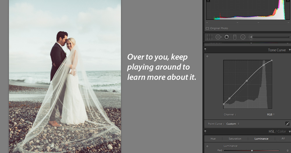
Over To You Now!
You can keep playing around with Tone Curves until you understand it practically. Pick an image try to adjust contrast, exposure, and colors using the Tone Curve. It would be a little daunting first, but you’ll get used to it once you master it. I hope you learned something new today. If you have questions drop them below in the comment section.
Need Help With Photoshop or Looking for Professional Support?
Whether you're just getting started with Photoshop or need expert-level assistance, we're here to help! Contact us for personalized Photoshop tutorials, project support, or creative services.
Get in touch today to take your skills or projects to the next level.
CONTACT US NOW📘 Want to Master Photoshop Faster?
🎁 Get Your FREE PDF E-Book "Top 10 Photoshop Tricks Every Designer Must Know" Now – Packed with expert tips, shortcuts, and techniques to boost your creativity & workflow.
👉 Download Your FREE PDF E-Book NOW!