In this tutorial, you’ll learn how to get the most out of any Lightroom preset. It’s easy to say that this Lightroom preset is not working for me (unless the preset is not working), it’s making my images underexposed or overexposed, colors are not popping, and so on.
I will show you what things you should keep in mind with an example when you apply a setting from presets to your images. And after going through this tutorial, you’ll be able to manage, tweak, and create your Lightroom presets very easily.
Basic Settings
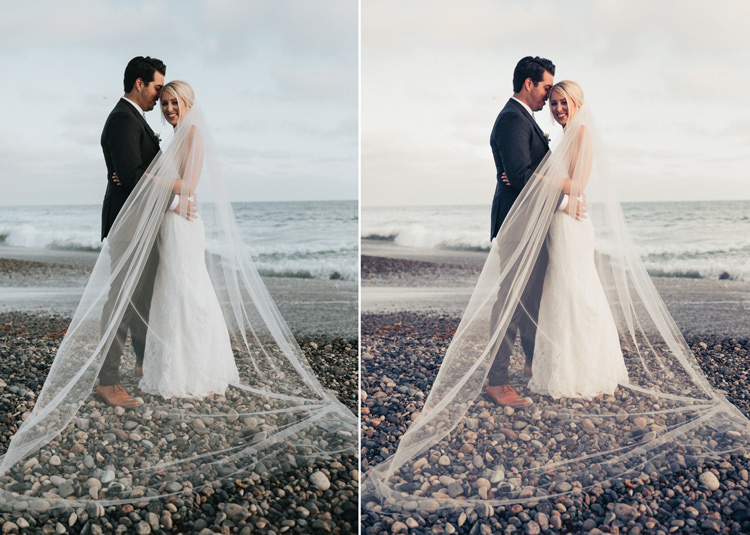
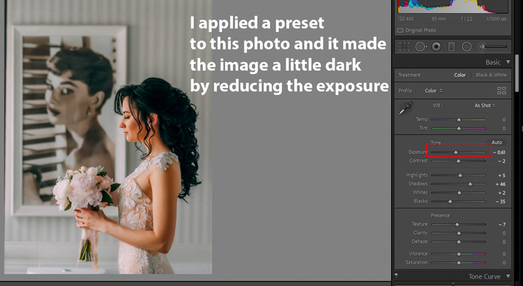
Most likely you want to apply settings on a photo that is properly exposed and set to a natural-looking white balance. Let’s say that you applied a preset and it made your image underexposed by reducing the exposure as you can see in the below image. I did like the other settings but it is making the photo dark.
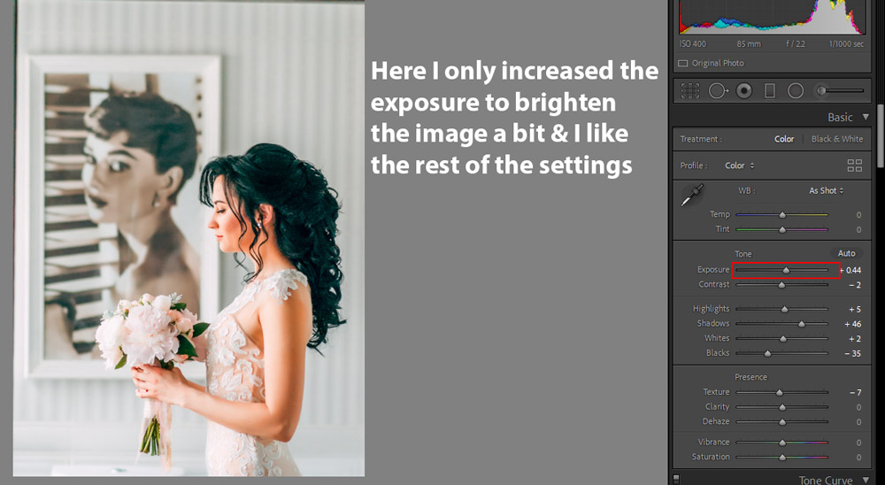
What you can do here is just tweak the exposure, maybe increase it a little bit or set it to 0. Maybe the presets will work then.
You can see in the below image by just fixing the exposure, what changes it has made. Similarly, you can tweak the settings of Highlights, Shadows, Blacks & Whites to bring a balanced exposure to a photo.
Vibrance Settings
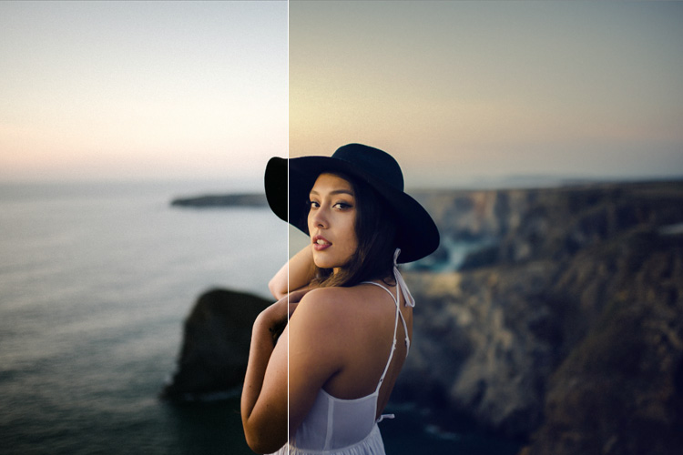
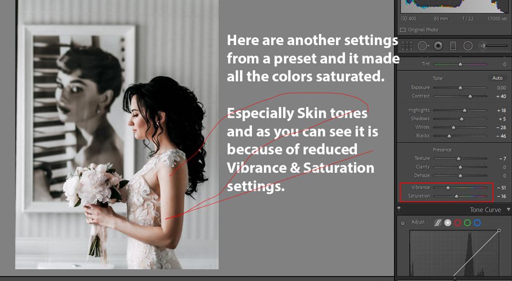
Another problem that you can face when you apply settings is working with colors. For example some presets might make your images dark and moody by reducing color saturation, maybe they are doing what they meant for. But if you use a preset and it made all the color fade away, you can get those colors back using the Vibrance & Saturation slider.
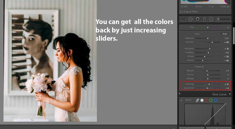
Just increase the Vibrance Settings and you will get all colors back again. Make sure you use the Vibrance Slider when you want to make colors pop instead of Saturation Slider as it protects delicate skin tones. We don’t want to harm skin tones when we are making colors pop.
Targeting Colors
Using Vibrance is fine when you want to make all colors pop at one go but what if you want to select a color, that you want to darken or pop or brighten in that case HSL TAB should be your go-to tool.
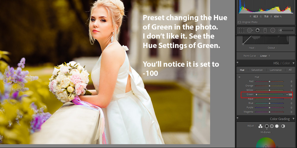
In the below image, a preset is changing the Hue of Greens. I don’t like it and I want a different hue for Green, you can see the settings in the HSL Tab below.
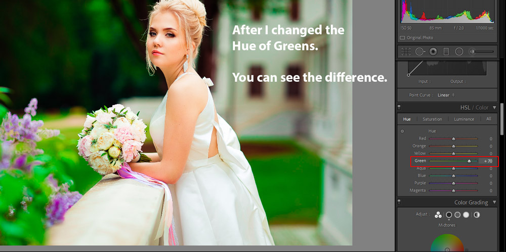
In the image below, I set the Hue of Greens to +70 and notice the difference and it made the green color pop. This is how you can target a color using the HSL TAB. Similarly, you can play around with Hue, Saturation, and Luminance sliders to target and tweak a color.
Color Grading Tab
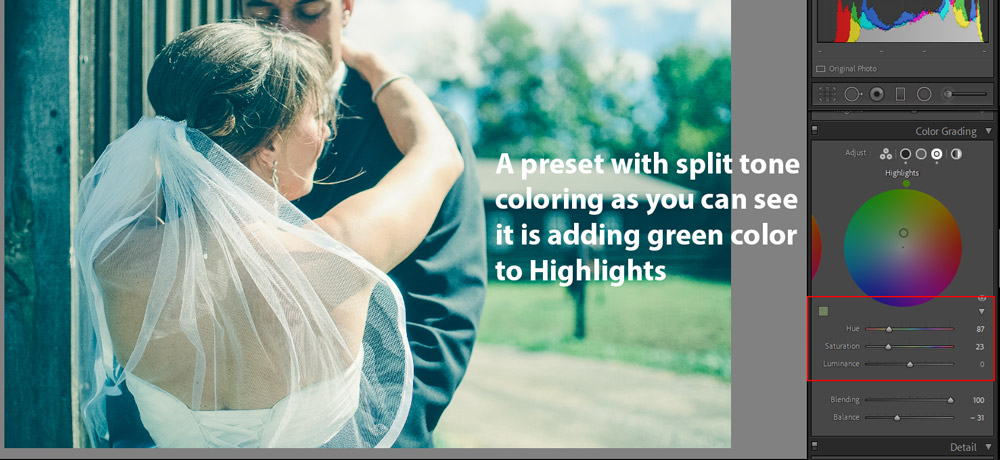
The new Color Grading Tab, previously Split Toning TAB, can help you tweak colors in Shadows, Highlights & Midtones. You can see in the below image that I applied a preset and it added a split toning effect to the photo.
It is adding cool tones to shadows and green tones to Highlights and I love the coloring in the shadows but I want to tweak the highlights coloring, I’d like to add a warm color that will help me make skin color look natural.
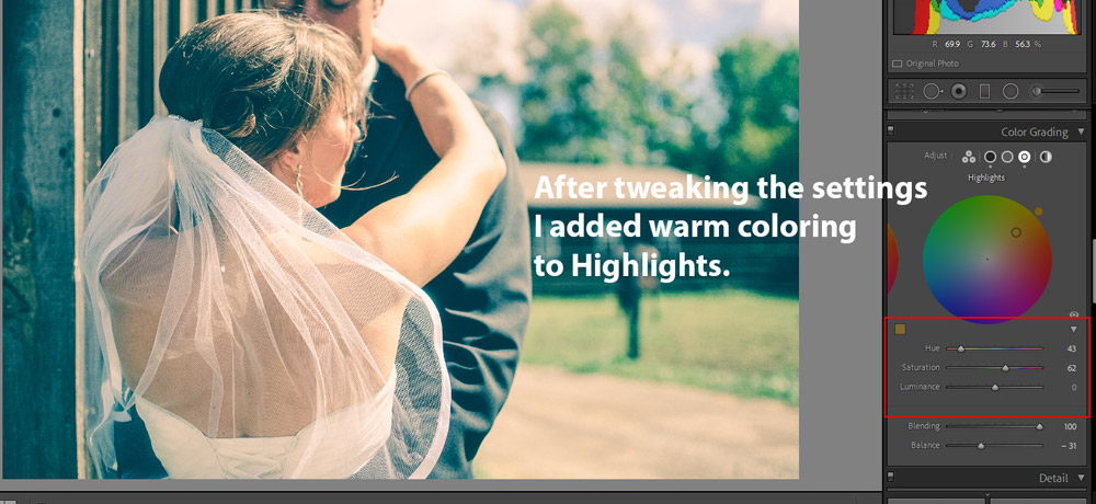
What I did, I went to Highlights Wheel, I changed the color from Green to Warm, and I played around with Hue & Saturation slider a little and you can see the results below:
I hope you found these tips useful and now you can tweak any Lightroom preset according to your Photography Style. Of course, there is a lot more to cover but I covered the usage of the basic settings that you’ll have to tweak every now & then. If you have questions you can comment down below and feel free to share any tip that can help people tweaking their presets in the comments. Keep learning!
Need Help With Photoshop or Looking for Professional Support?
Whether you're just getting started with Photoshop or need expert-level assistance, we're here to help! Contact us for personalized Photoshop tutorials, project support, or creative services.
Get in touch today to take your skills or projects to the next level.
CONTACT US NOW📘 Want to Master Photoshop Faster?
🎁 Get Your FREE PDF E-Book "Top 10 Photoshop Tricks Every Designer Must Know" Now – Packed with expert tips, shortcuts, and techniques to boost your creativity & workflow.
👉 Download Your FREE PDF E-Book NOW!