
In this tutorial, I’ll show you how you can steal the color grading from any movie that you might have found interesting. You gonna learn how to choose colors for highlights, shadows & midtones from reference images and add them to your images using adjustment layers. We gonna also learn how to examine color tones in movies clip, apply coloring after examining the colors, & take care of skin tones while keeping other tones intact.
Before color grading:
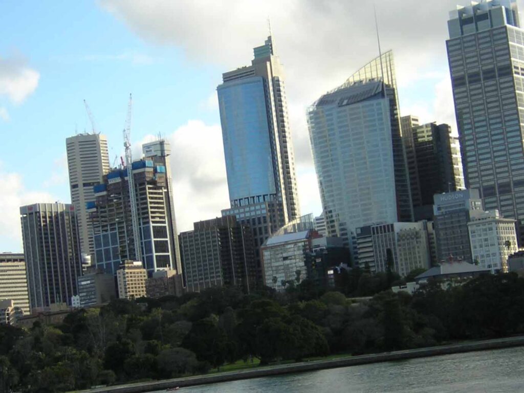
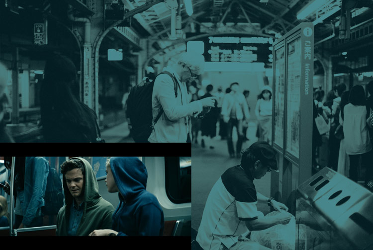
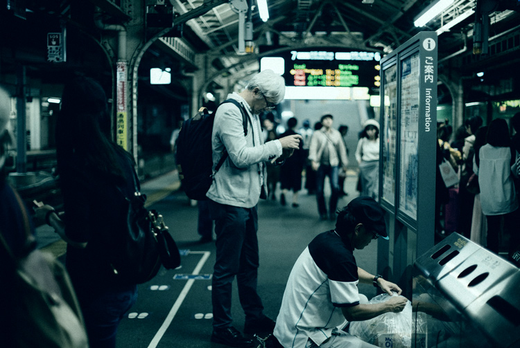
After color grading:

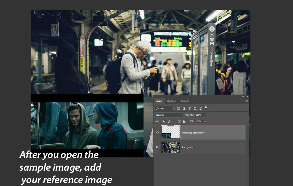
Step 1 – Open the Sample & Reference Image
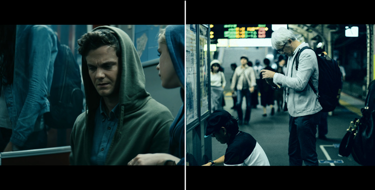
I was watching The Boys Tv show on Amazon prime and I love the color grading looks for this series. I wanted to give it a shot to see if I can replicate the color grading in other images. I captured a screenshot of the movie clip just to use it as a reference & to analyze what colors are being used in the clip.
First, I opened the sample image, download it from Unsplash, by selecting File > Open & I also opened the my reference image. I scaled it down so I can see the color for reference.
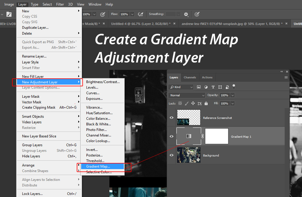
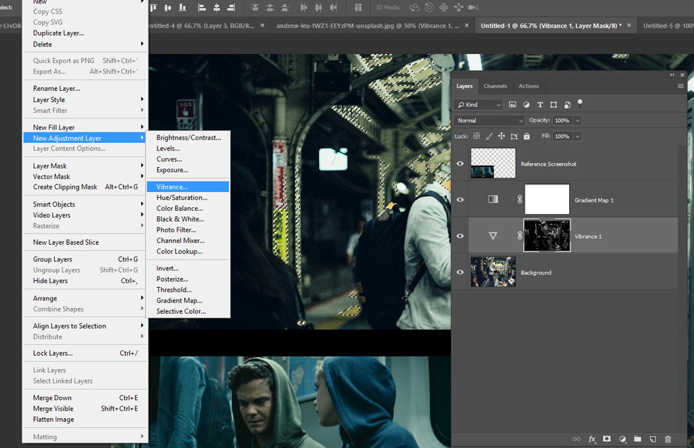
Step 2 – Create Gradient Map Adjustment
We’ll add coloring to shadows, highlights & midtones region of the image using Gradient Map. Go to Layer > New Adjustment Layer > Gradient Map and create the Gradient Map adjustment layer.
Make sure whatever adjustments layers we make starting from now must be underneath our reference image. This is to make sure that we don’t affect the colors of our reference image.
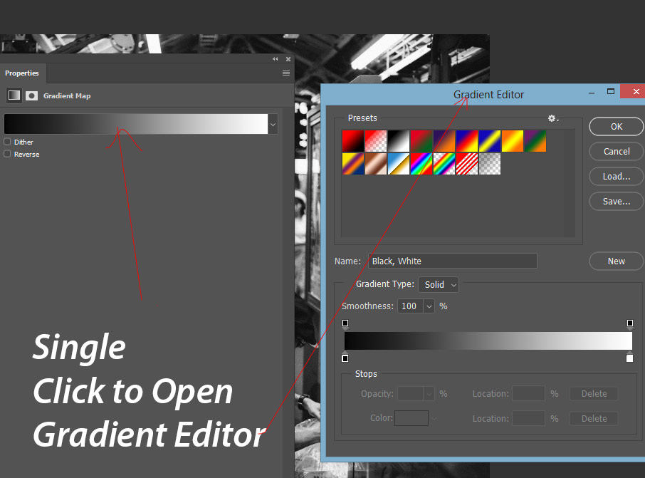
Open the gradient editor, where we will add coloring the image, by single-clicking on it. Once you click in the middle of the gradient, Gradient Editor dialog box will appear on the screen.
Step 3 – Add Coloring to Shadows, Midtones & Highlights
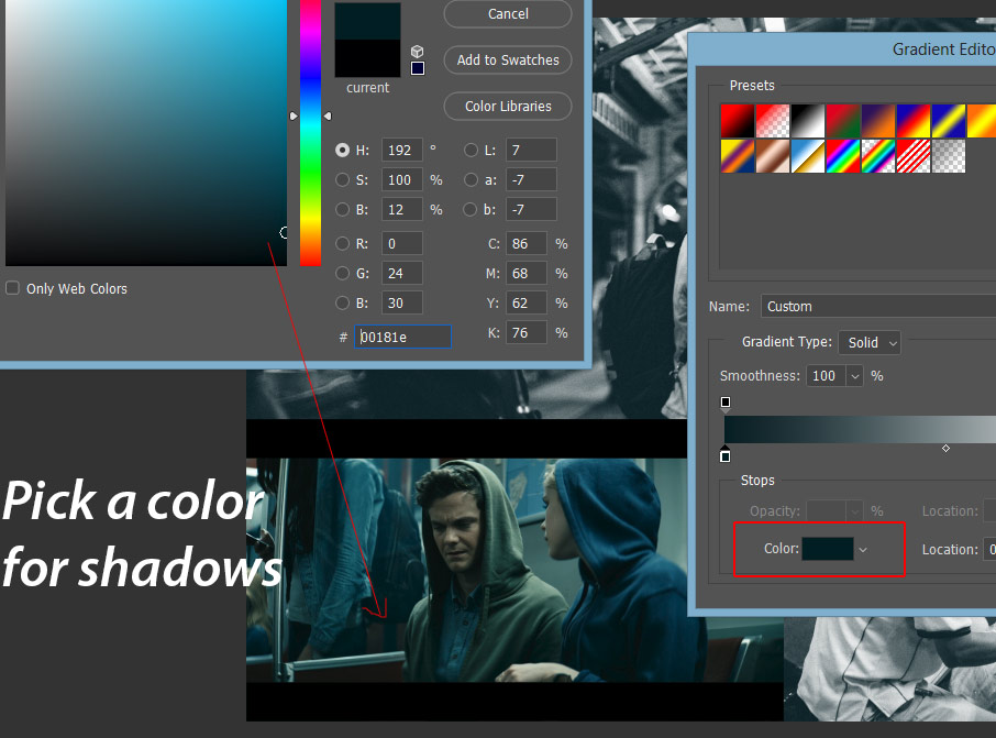
By default, a black/white gradient is selected, and if you are seeing a different gradient don’t worry about it, you can change it by choosing the third preset (see the presets section). Click on the left slider as shown in the image below and this will add coloring to the shadows of the image. First, click on the slider and then click on the color box to choose the color.
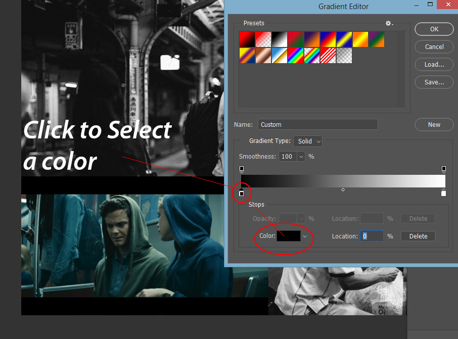
Now reap the benefit of the reference image, select the darkest color that you see in the reference image for shadows. It should not be much darker but dark enough to represent shadows, if you don’t know how to select it, you can copy the color code from the screen. I chose the #00181e color for Shadows.
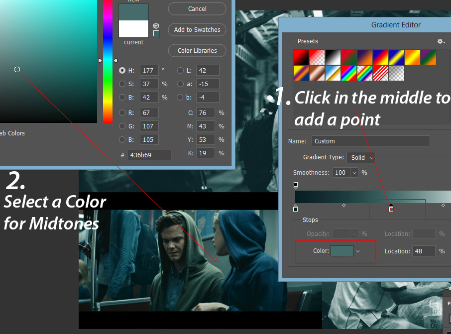
I added a point in the middle by just clicking on it. You can add a point wherever you want to by just clicking on the gradient. I selected #436b69 color from the reference image for midtones. You can also see the spot where I chose the color from.
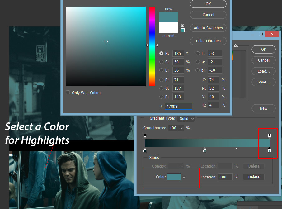
Finally, I chose the color for Highlights by sampling a color from the girl’s jacket. The color is #47898f which is the color for highlights. Just make sure to select the brightest color from the image. It doesn’t matter if you don’t choose a bright color but make sure choose the color for highlights that is brighter than the color that we chose for midtones & shadows.
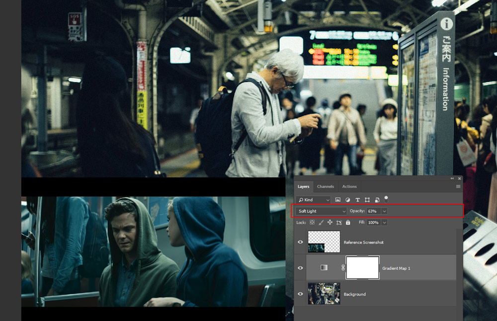
Step 4 – Soft Light Blending Mode
Here you can see how our image looks in the Normal Mode:
I changed the blending mode to Soft Light & reduced the opacity to 63%.
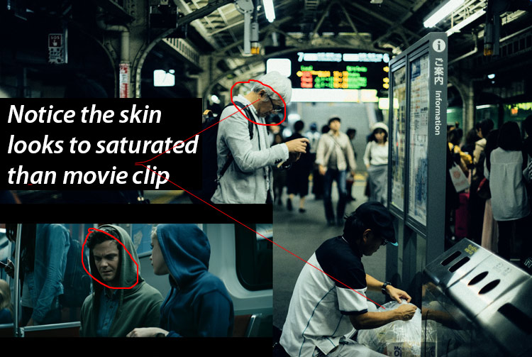
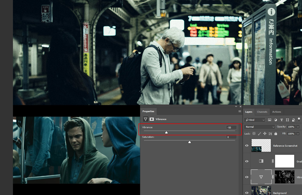
Step 5 – Target Skin Tones
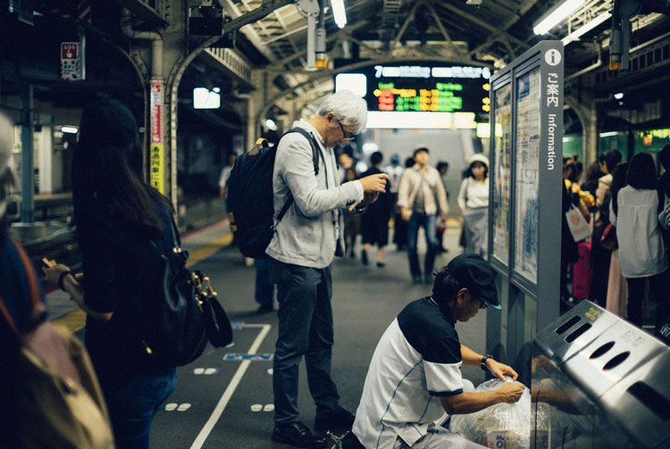
If you notice you can see the skin tones look too saturated or vibrant compared to reference image skin coloring. In the reference image, the skin coloring is muted and we need to target skin colors to mute them. See the below image to compare skin tones.
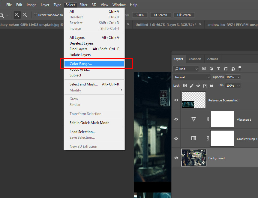
Go to Select > Color Range:
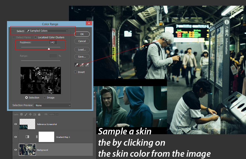
In the Color Range dialog box, set the Select: Sampled Colors, the Eyedropper Tool will get activated hover it over the skin color of the man to select the skin color. Set the Fuzziness to 142 to select more colors that matched or come near the selected color.
While the selection is active, go to Layer > New Adjustment Layer > Vibrance and create a Vibrance adjustment layer. Once you created a Vibrance adjustment layer Photoshop will automatically load the selection into the layer mask of the Vibrance layer.
Now reduce the vibrance to -50 to mute skin tones.
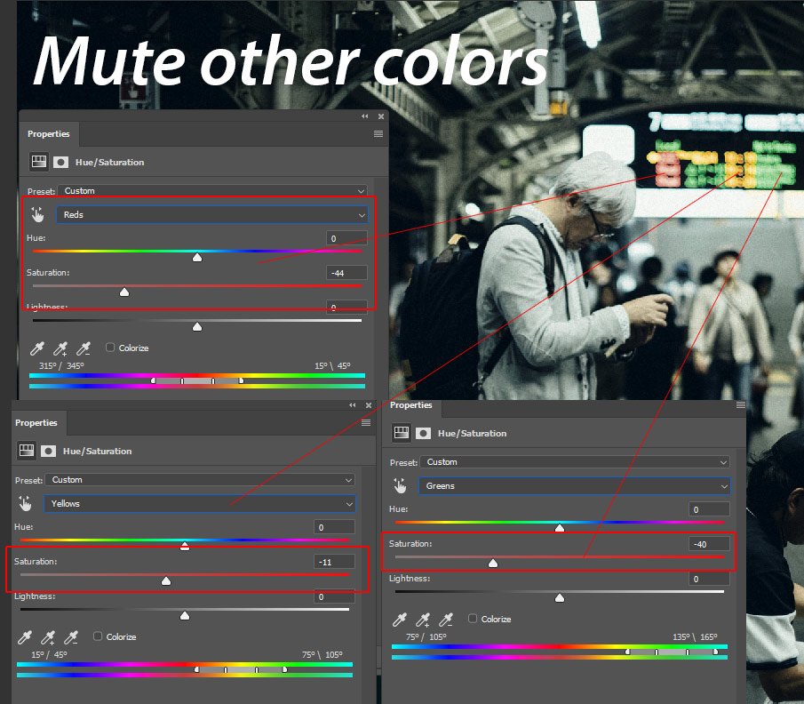
Step 6 – Mute Other Color Tones
I noticed the information on the screen is look too saturated so I targeted those colors using the Hue/Saturation adjustment layer.
You can go to Layer > New Adjustment Layer > Hue/Saturation. I selected Red, Green & Yellow and I used the Saturation Sliders to mute the tones. You can use this adjustment layer to mute other color tones if you are still seeing vibrant colors in your image.
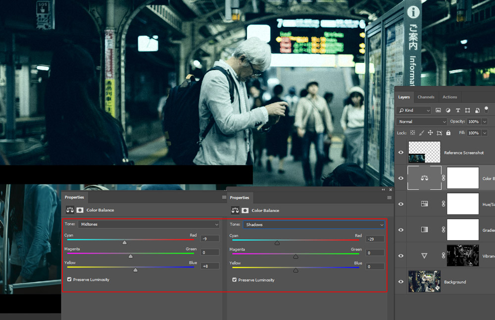
Step 7 – Add Final Coloring
In the end, I added some cyan coloring to the Shadows & Midtones using the Color Balance adjustment layer. You can go to Layer > New Adjustment Layer > Color Balance & see the settings below of Midtones & Shadows.
Here are my final results:
Thanks for making this far. Color grading is an art & you have to keep in my that what sort of coloring you want in your images to start the procedure. It could be flashy or muted coloring or you can take the inspiration from the movies just like we did in this tutorial. If you have questions feel free to comment below.
Need Help With Photoshop or Looking for Professional Support?
Whether you're just getting started with Photoshop or need expert-level assistance, we're here to help! Contact us for personalized Photoshop tutorials, project support, or creative services.
Get in touch today to take your skills or projects to the next level.
CONTACT US NOW📘 Want to Master Photoshop Faster?
🎁 Get Your FREE PDF E-Book "Top 10 Photoshop Tricks Every Designer Must Know" Now – Packed with expert tips, shortcuts, and techniques to boost your creativity & workflow.
👉 Download Your FREE PDF E-Book NOW!