
In this tutorial, you’ll learn how minor or tiny steps can lead to amazing color grading results. The best part you don’t have to be a pro in Photoshop to achieve eye-catching color in our images but you do need to keep some tips in your mind which exactly I am going to show you. Not only you’ll learn how to color grade an image but improving the image by adding colors and light exactly where you want.
Step 1 – Analyze Images
The first thing you need do to before you begin color grading your images is to find out what’s in the image. What colors it has the most? Are the shadows are dim? Are the highlights need lifting? You gotta ask yourself these questions if you want to color grade images like a pro.
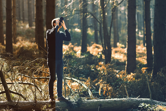
Let put theory into practice, if you open the below image by downloading it here, you will notice the yellow color is the most visible color in the image and I can cancel it by adding blue color as these colors complement each other or negative color of yellow is blue.
Also, I have enough information on shadows but highlights are dim which need a bit of lifting.

Step 2 – Boost Highlights
Once you have a structure I mean what you are going to do with the image, you can proceed from there and start adding colors to the image. But before adding colors let’s boost our image highlights as they appear a bit dim.
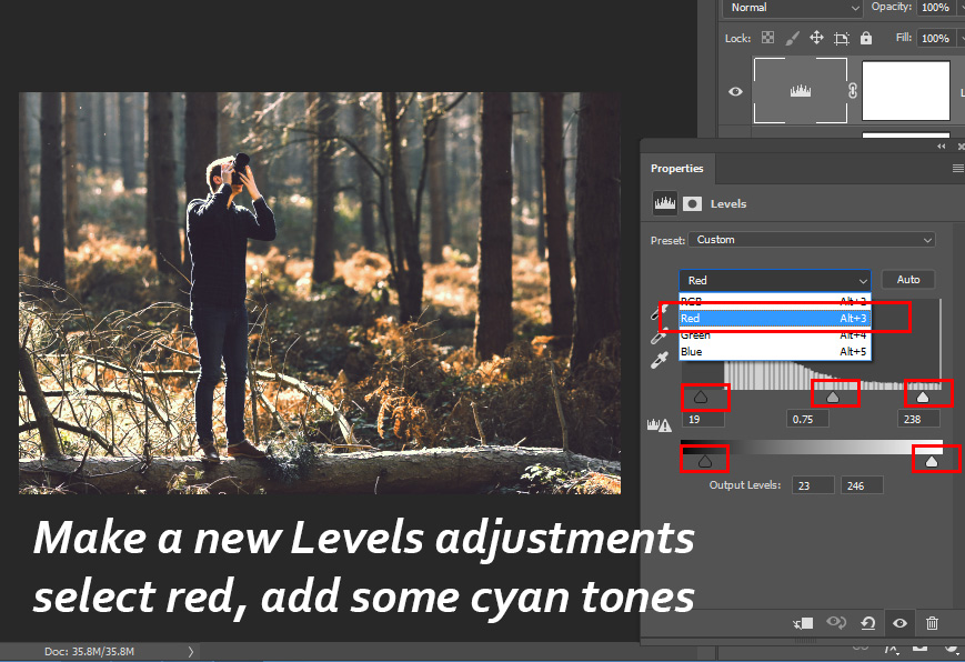
Make a Levels adjustment layer by selecting Layer > New Adjustment Layer > Levels.

You can see in the below image I used the white slider to boost lights on the highlights. You need to drag the white slider to the left to add brightness to the highlights.

Step 3 – Begin Coloring
My highlights levels look pretty much good and I don’t need to do much there to improve them further and shadows levels are nice and they have a lot of information.
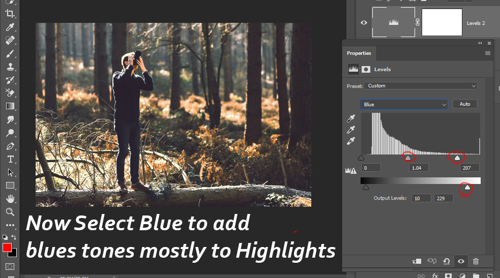
Now I can begin coloring, to do this, I used another Levels adjustment layer but this time, I selected Reds to add cyan tones to the image using the settings below:
After that, I used Blue, to add blue tones mostly to the highlights but don’t overdo it as it will cancel out color of the light which is visible on the background (grass, trees, & bushes):
Here are the results so far & isn’t it looks amazing:

Step 4 – Target Midtones
If you like “Ah, color in the shadows & highlights looks good I don’t want to add colors anymore” then you can target midtones of the image and see how it looks. The best way to do this using Selective’s Colors Neutral Settings.
I did the same using the settings below and you can see the image looks blueish right now:

Remember I am aiming to add colors in shadows here as we already did for highlights in step 3 when we added blue color to the highlights. I want to keep the effect of Selective Color between shadow and midtones region because there is a yellow bright highlights reflecting in the grass, trees, & bushes. If you add more blue tones to highlights it will cancel out the yellow light natural color and that will look unnatural.
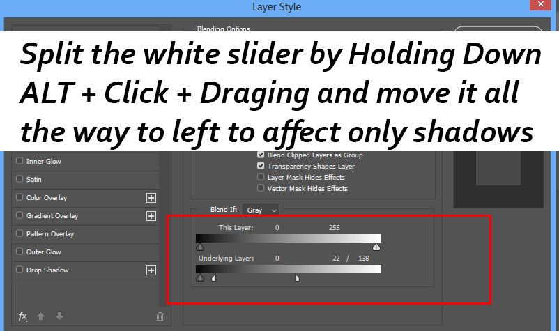
Right-click on the layer and choose Blending Options.

In the Blend-IF Section split the white slider by Holding Down ALT Key + Click & Drag to left. Once you split the slider, drag it to left & while doing so keep an eye on the image to see how the blue color is disappearing from the entire image & being added to shadows of the image. Stop where you see the results that you are looking for!
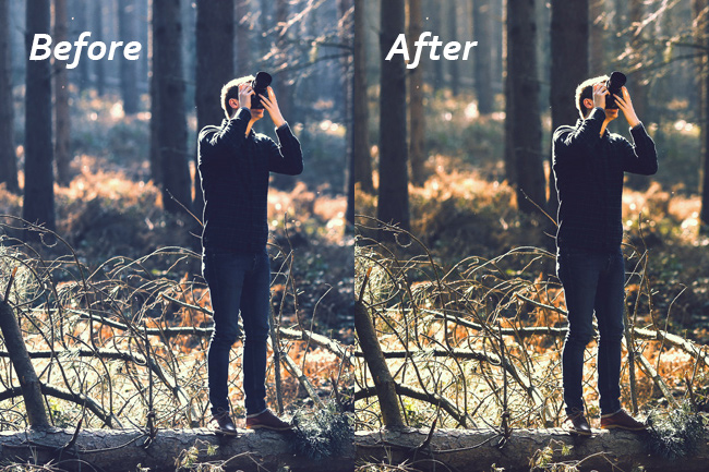
Results after using Blend-IF:

Here you can compare results before & after using Blend-IF:
Step 5 – Paint Lights
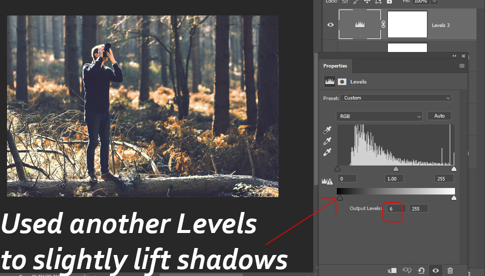
Before moving forward I lifted shadows a bit using another Levels adjustment layer.
Create a new layer by pressing CTRL + SHIFT + N & I painted some lights on the background using a dark orange color. Always use a soft round brush with low opacity & flow around 30%-40% when you paint light or mask any image parts.

I changed the blending mode to Screen and reduced the opacity to 72%.
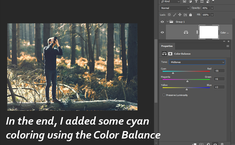
Step 6 – Finish Coloring
In the end, I used the Color Balance adjustment layer to finish the coloring process. I added cyan coloring to the image as I tend towards cyan color for this image. But you can also play around with blue & yellow color but try to close to the colors which image already have.
Here are my final results:
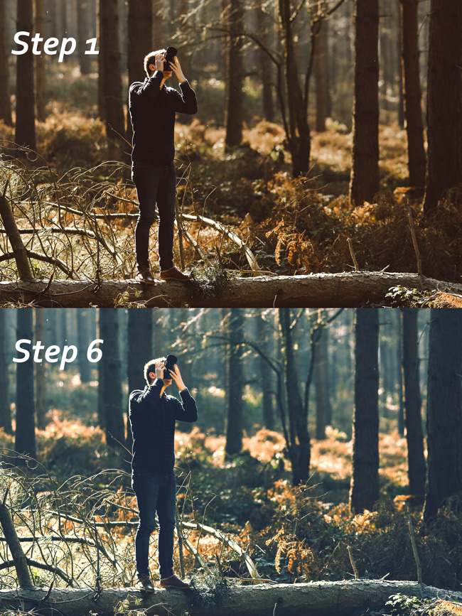
Here you can compare results from Step 1 to Step 6 and you can see beautiful coloring, rich colors, highlights & shadows look natural, you couldn’t ask for more. I hope you enjoyed the tutorial and making it this far. Please provide any feedback that you have in the comment section below.
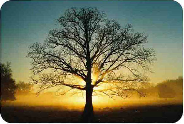
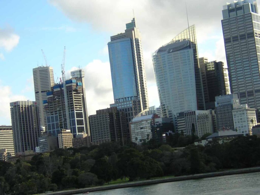
Some more examples:
Example 1:
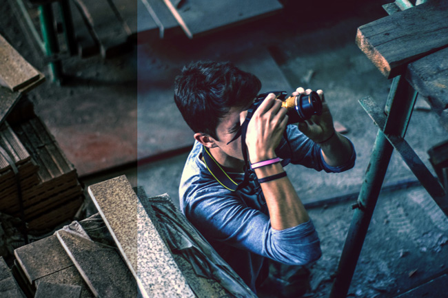
Example 2:
Need Help With Photoshop or Looking for Professional Support?
Whether you're just getting started with Photoshop or need expert-level assistance, we're here to help! Contact us for personalized Photoshop tutorials, project support, or creative services.
Get in touch today to take your skills or projects to the next level.
CONTACT US NOW📘 Want to Master Photoshop Faster?
🎁 Get Your FREE PDF E-Book "Top 10 Photoshop Tricks Every Designer Must Know" Now – Packed with expert tips, shortcuts, and techniques to boost your creativity & workflow.
👉 Download Your FREE PDF E-Book NOW!