Learn how to add styles and coloring in Photoshop, create eye-catching images, and realistic light effects using color toning techniques. We’ll use the combination of a bunch of adjustment layers to create a stunning effect and you can use these techniques to add beautiful coloring to any image.
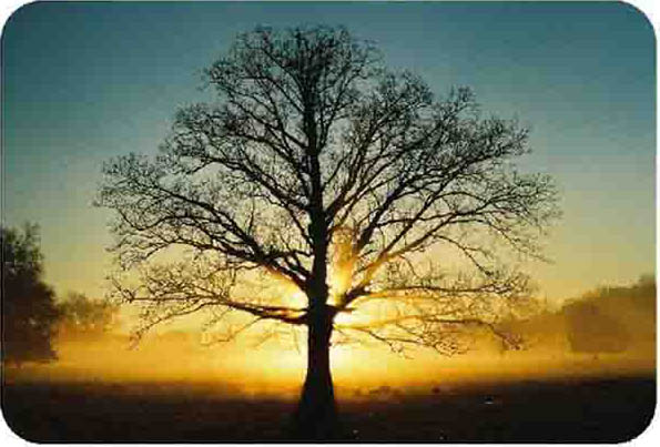
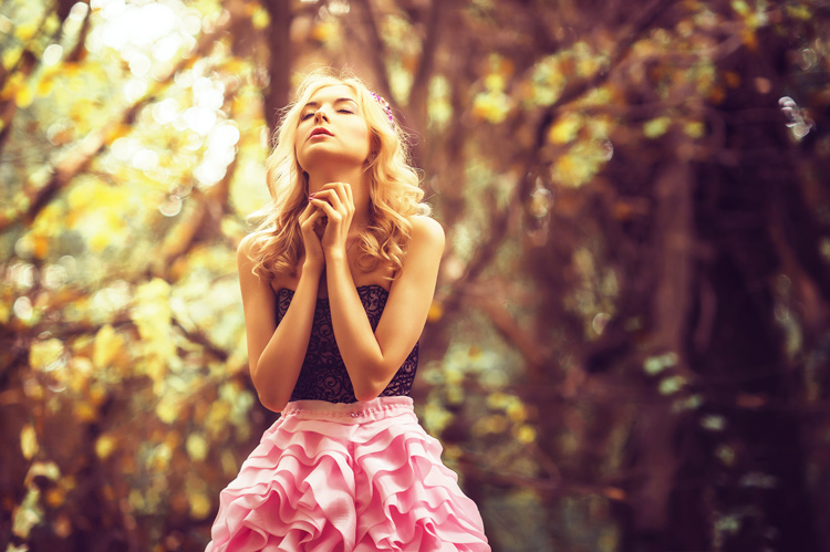
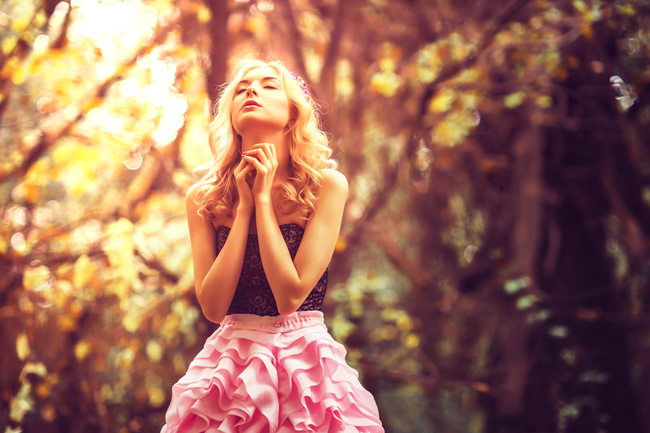
Before:
After:
Step 1 – Open Images
You need to pick an image that is most suitable for color toning. In my opinion, always pick an image that is on the side of desaturation or most likely colors are faded or sorta. If you have images that are already on a bright side and have enough colors that are really popping out in that case you have to go super subtle.
Go to File > Open and open the image in Photoshop and you can download the same image here.

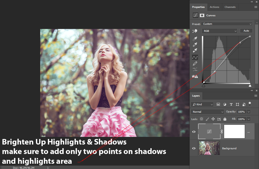
Step 2 – Brighten Up Shadows & Highlights
Now we’ll brighten up shadows & highlights but please do not overdo this because you can destroy details of the image and you don’t want freaky white lights and over-exposed shadows with no details in your image.
To give a boost of brightness to image, go to Layer > New Adjustment Layer > Curves.

You can notice in the below image that I added two-point, one in shadows & another one in highlights, to brighten image gently and I went super subtle here.
You can do the same using the following settings below:
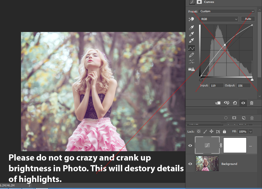
The bad example is below where you crank up the brightness of the image without worrying about the details. Do not do this as you can see we have lost a ton of details in highlights and I don’t recommend doing this at all on any image.
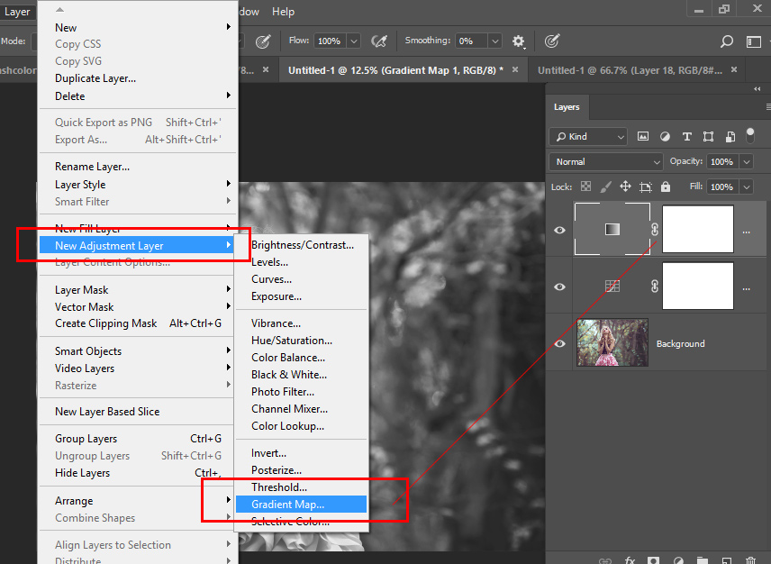
Step 3 – Color Toning with Gradient Map
Gradient map is one of the most underestimated adjustment layer and most of the time people don’t use it. Maybe they don’t know how it works or they tend to use other adjustment layers but when you used this layer it will accurately add colors to shadows, midtones, and highlights of the image.
If you want to learn more about the adjustment layer check out my in-depth guide on adjustment layers.
Go to Layer > New Adjustment Layer > Gradient Map:
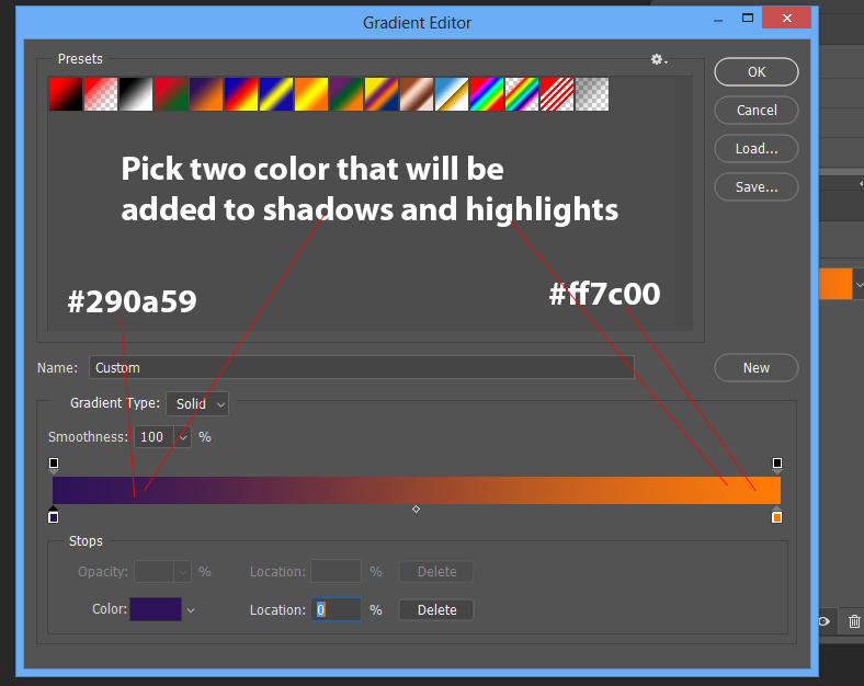
By-Default you’ll see a default gradient selected but you can double-click on it and change colors for color toning. So double-click on it and bring up the gradient editor dialog box.

I picked two colors, blue one = #290a59 for shadows (dark areas) & orange = #ff7c00 for highlights (bright areas), but you can add any color if you want by clicking & adding a point on the gradient and choose different colors if you like. For the sake of simplicity, I only used two colors but as I said you can pick as many colors as you want.
If you see the image it will resemble below image and you can see the colors have been added to our image. You can pick different color schemes by editing the gradient colors but I am adding a kinda autumn coloring here and that is why I picked these colors.
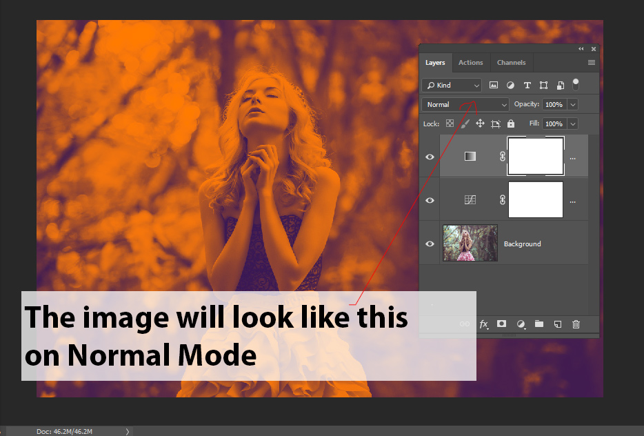
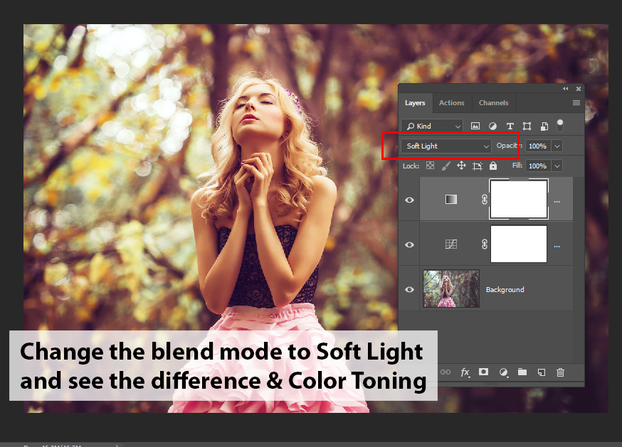
If you change the blending mode of the layer to Soft Light (Always use this blend mode with Gradients), you’ll see the colors are now blended with the image.
And it is giving the image a beautiful autumn coloring:
Step 4 – Add Light Effects
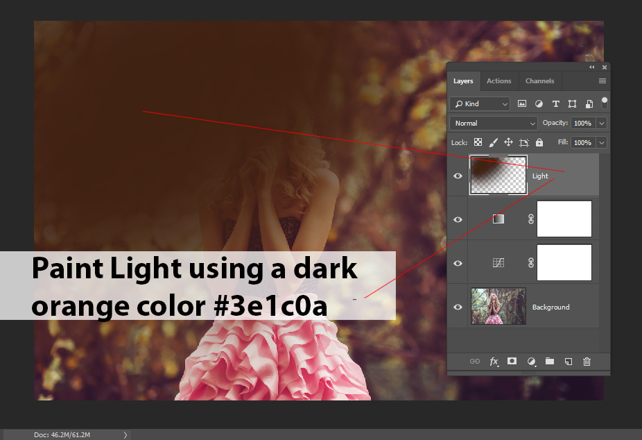
If you notice you can tell the image got a little bit darker while the colors look good but we have to create a light source so the colors can pop out.
To create a light effect, create a new layer by pressing CTRL + SHIT + N & name it “light”.
Use a soft round brush and pick a dark orange color, I chose #3e1c0a, and paint it on the top left of the image.
Change the blending mode to Linear Dodge and you’ll see a beautiful glowing light effect is now added to the image. You can also play around with the opacity.

Results so far & you can stop here if you want the same results shown in the featured image:
Step 5 – Manipulate Colors
If you are happy with results then you can quit here but I found that orange color is too much on the image and I want to reduce it by adding new colors to the image. You can also do the same by reducing the opacity of the Gradient Map.
Go to Layer > New Adjustment Layer > Color Balance and use the midtones settings to manipulate color of the image.
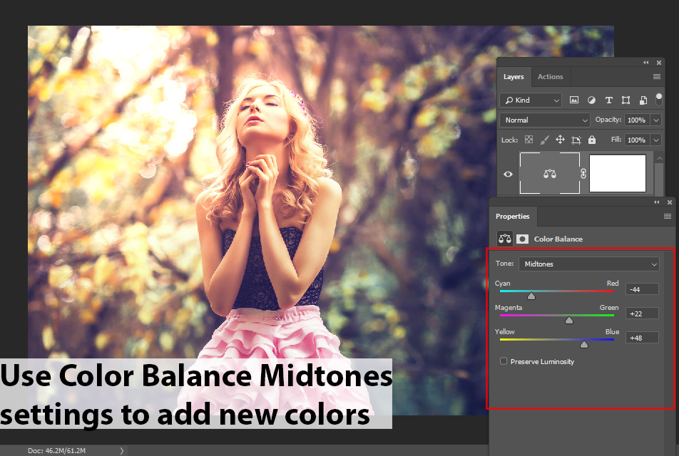
See now we have a very soft coloring effect on the image. You can play around with the settings for more different coloring.
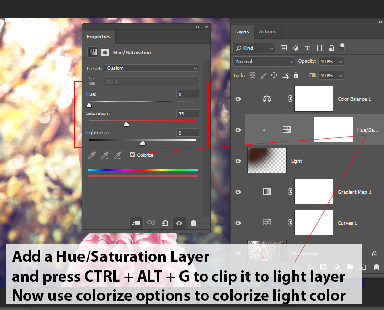
Step 6 – Manipulate Light Color
Not only we can manipulate and change the colors of the entire image but we do the same for our light effect. To do this, add a Hue/Saturation Adjustment Layer and press CTRL + ALT + G to clip this layer to Light Layer.
Now you can check Colorize option and then play around with Hue, Sautration & Lightness Sliders to change the color of light.
Here how I changed it to bit on the magenta side:

Here you can see I changed it to blue:
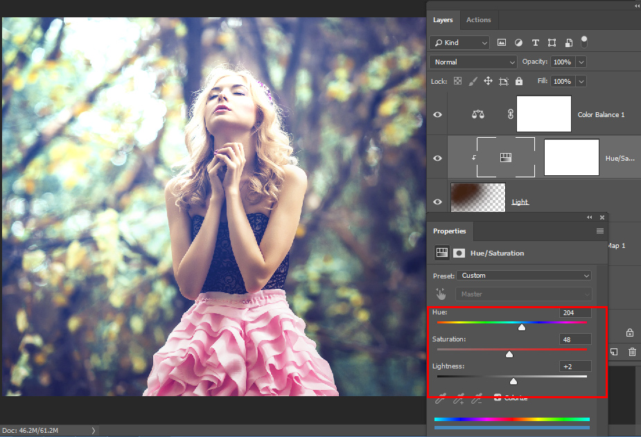
You can do this until you are satisfied with the results.
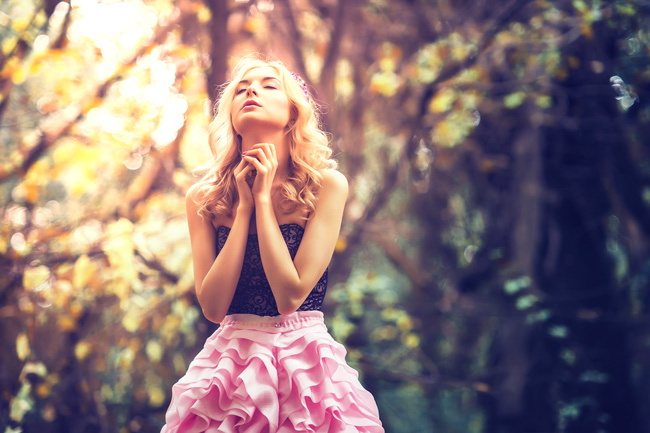
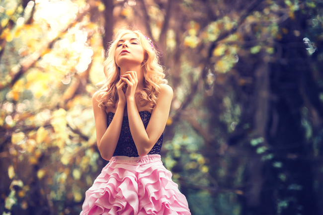
Here are my final results:
Need Help With Photoshop or Looking for Professional Support?
Whether you're just getting started with Photoshop or need expert-level assistance, we're here to help! Contact us for personalized Photoshop tutorials, project support, or creative services.
Get in touch today to take your skills or projects to the next level.
CONTACT US NOW📘 Want to Master Photoshop Faster?
🎁 Get Your FREE PDF E-Book "Top 10 Photoshop Tricks Every Designer Must Know" Now – Packed with expert tips, shortcuts, and techniques to boost your creativity & workflow.
👉 Download Your FREE PDF E-Book NOW!