
In this tutorial, we’ll learn how to color grade your images in just 5 minutes. This is going to be a quick tutorial with some cool tips and techniques on how to manipulate colors in your image. We’ll first balance out details in our image and then we’ll move forward for color manipulation using adjustment layers. Let’s get started!
Step 1 – Choose Image Having High Contrast
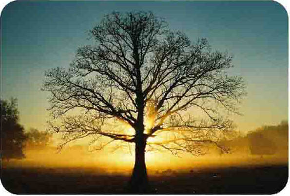
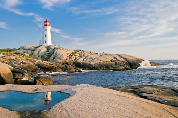
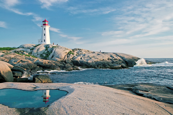
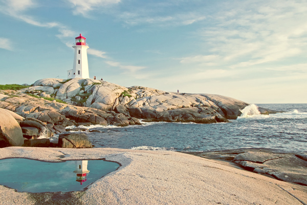
So the first step is crucial that choosing an image for color grading. When it comes to picking an image for color grading I’d recommend going for images with high contrast such as below image. You can download this image here if you want to follow along.
You can see the image has high contrast, shadows don’t have much details and highlights are really good.
Step 2 – Adding Details to Shadows
First thing you can do before color grading your image is that you must have enough details in your image so the color you are going to achieve should reflect in every area bright and clear.
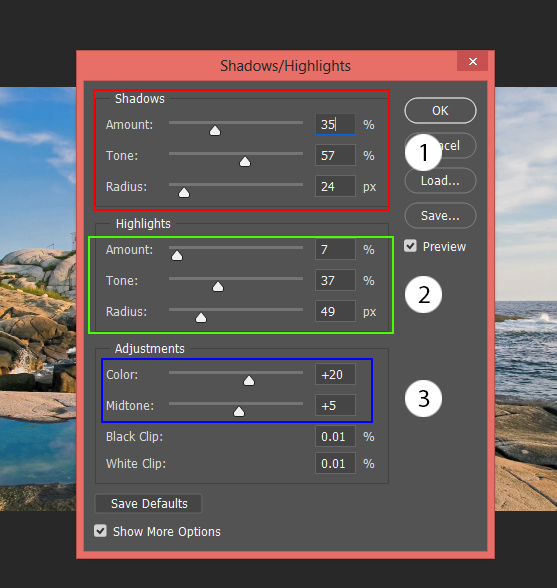
I am going to add more details to the shadows by brightening them. To do this, I am using Shadow/Highlights.
Convert your image into Smart Object by right-clicking on it and then choose “Convert to Smart Object”.
Go to Image > Adjustments > Shadows/Highlights and use the settings below. These settings will help us recovering details in shadows and also it will dim highlights a bit. In short, whatever you do on the Shadow section it brightens the shadows and whatever you do on Highlights section it will darken the highlights. If you want more details on this adjustment, you can follow my fix exposure tutorial.
You can also play around with Color and Midtones slider to perfect color and contrast in our image.
Here are the results:
Step 3 – Using Adjustment Layer to Color Grade
Now it’s time to color grade your image. There are no precise steps that you can follow to start manipulating the color of your image but I consider this process as fun. You can play around with a bunch of adjustment layers and start changing colors in your image.
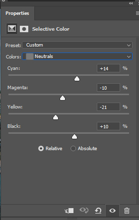
One of the best ways to target different color tones is by using Selective Color adjustment. Right now I aiming to cool down tones in the image which means adding blue color tones to the image and removing warm color tones.
To do this, I targeted Yellow and Blue colors using Selective Color as these are colors happens to be the most in the image.
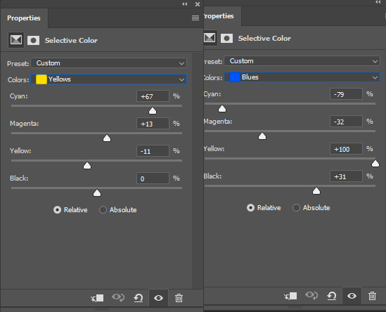
I also targeted mid-tones areas using Neutral color. You can see the settings below.
You can see the results below with cooling tones in the image:
Step 4 – Adding and Enhancing Colors
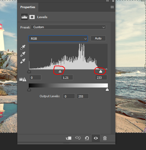
Now it’s time to add more color to the image. I used Levels adjustment layer using Reds and Blue.
This will add red warm colors to the shadows and blue & cool color tones to the highlights.
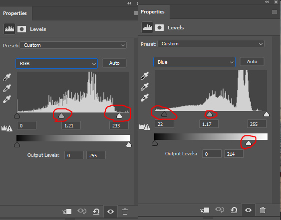
I also used RGB Properties to brighten up the image. This will help pop up the colors better in the image.
Here are the results when I set the opacity of Levels to 76%. You can always play with the opacity of adjustment layers to better blend their effect with the rest of the image :
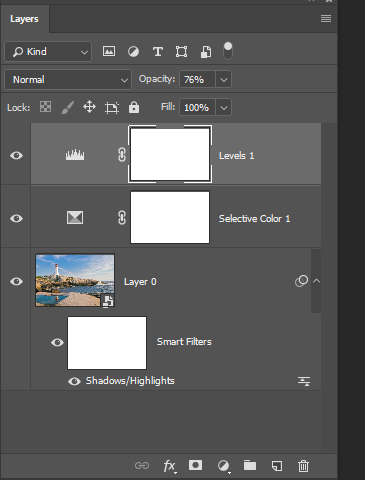
Here you can see my layer stack so far:
Step 5 – Finishing Touches with Adobe Camera Raw
Finally, when everything is set what you can do is that use Adobe Camera Raw to fix tiny details. Press CTRL + ALT + SHIFT + E and convert this layer into Smart Object.
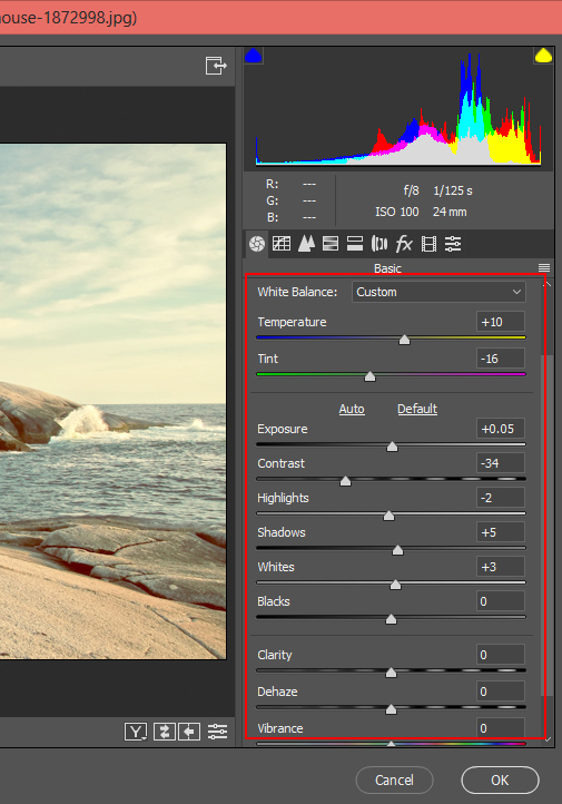
Go to Filter > Adobe Camera Raw and use the settings below or maybe play around with them.
With the below setting, I adding more temp (adding warm tones) and reducing tint a bit. I also reduced the contrast and increased the exposure a bit. You can do these sorts of things in Adobe Camera Raw for finishing touches. Once I applied these settings, I reduced the opacity of the layer to 60%.
The image looks really good decent colors throughout every region of the image.

Before:

After:

The best thing that you can when it comes manipulating colors in your image is you must play around and experiment with different colors using adjustment layers. Once you know what color is working for your image then try to enhance it but make sure do not get a image that has too much contrast. I hope you have learned something new today.
Need Help With Photoshop or Looking for Professional Support?
Whether you're just getting started with Photoshop or need expert-level assistance, we're here to help! Contact us for personalized Photoshop tutorials, project support, or creative services.
Get in touch today to take your skills or projects to the next level.
CONTACT US NOW